Issue 01 – From Frustration to Flow: Designing a Porch That Brought Summer Back
Location: Winnipeg
Architecture: Dark Horse Architecture Inc.
Structure: Wolfrom Engineering Ltd.
Builder: Anvil Tree Inc.
Landscape: BRocke Landscaping
1. Why This Porch?
Let me tell you something, our front yard and I have a complicated history.
Now, if you ask my family, they’ll probably roll their eyes and say I’m being dramatic. “It wasn’t that bad,” they’ll insist. And maybe it wasn’t, at least not from the street. But from my side of things?
For starters, the old porch, a narrow, traditional, five-foot-deep platform, wasn’t exactly functional. You couldn’t really sit on it, and it didn’t offer much shelter or purpose. The rest of the yard? Years of patchy grass, relentless weeds, allergy flare-ups, and bug ambushes made it feel like the yard and I were locked in a passive-aggressive standoff.
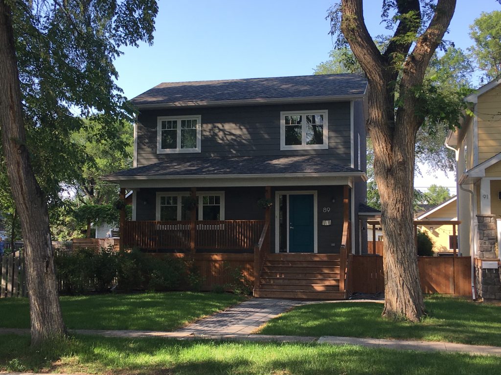
The house sits about 30 feet back from the sidewalk, with three majestic elm trees flanking the lot. In summer, they create the most peaceful, dappled shade you could ask for a south facing house, but that same shade made it nearly impossible to maintain healthy grass. We tried re-sodding, overseeding, fertilizing, the works. Nothing stuck. The lawn would look decent for a month or two, then fade back into its usual half-dead, weed-riddled self.
And let’s not forget the bugs. Mosquitoes, ticks, wasps, horseflies, basically everything I’d happily keep on the other side of a screen. I’m not an outdoorsy guy, and I’ve got a whole list of allergies to boot. So the yard became this source of constant stress, high maintenance, low reward, and honestly, not all that enjoyable.
But you know what was lovely? The lilacs. Right in front of the house, growing wild and fragrant every spring. I really liked those bushes. They brought joy and memory and this deep sense of place. So when we made the decision to transform the front yard, the lilacs were the hardest thing to part with. We had to remove them to make way for the porch, but we managed to save a small one, tucked it into the corner. It’s holding on, and with any luck, it’ll bloom again one day. A legacy from the past.
Now, this wasn’t just about building a screened front porch. That was part of it, a beautiful, shaded, bug-free space where we could actually use our front yard. But the bigger shift was in how we approached the whole site. We let go of the idea of fighting nature. No more obsessing over lawn perfection. Instead, we reimagined the space through a lens of sustainability and wellbeing.
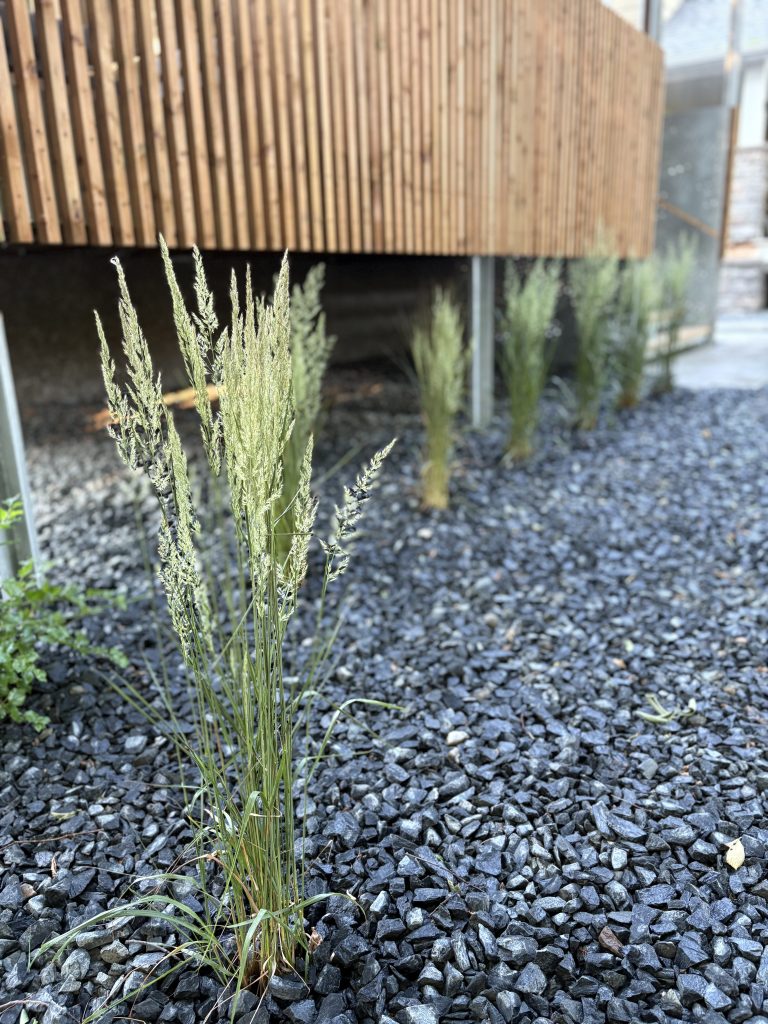
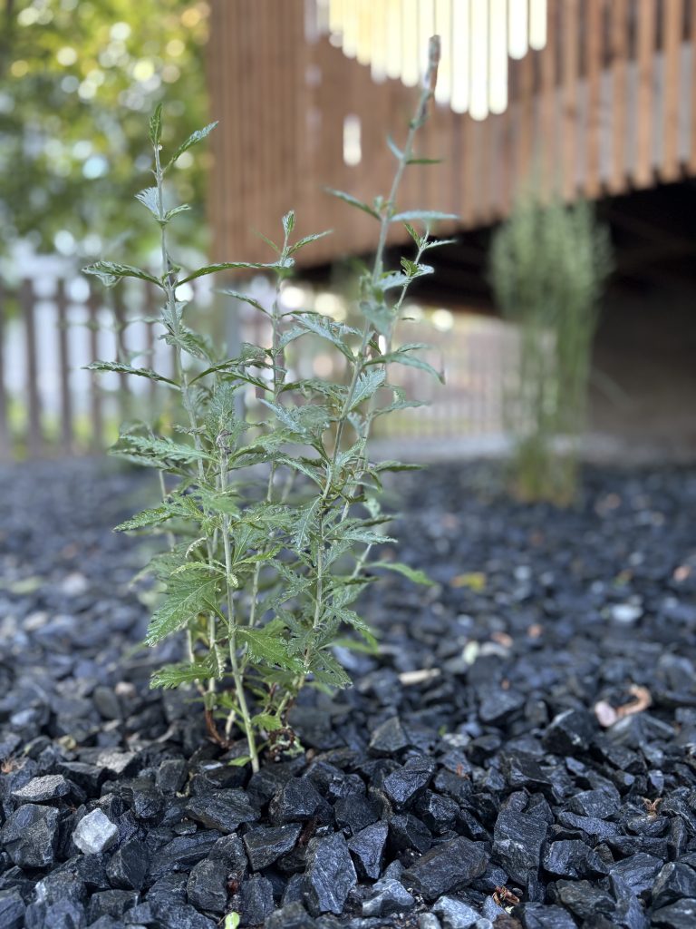
We embraced xeriscaping, low-water, low-maintenance, climate-appropriate planting. No thirsty turf grass, no constant upkeep. Just carefully chosen, resilient species like Karl Foerster grasses, Russian sage, and silver mound. Plants that actually belong here. The kind that sway in the breeze, reflect the seasons, and thrive without begging for attention.
The result? A front yard that finally feels like it fits us. It’s calming. It’s functional. It supports our health, our climate, and our sanity (I hope). And, it’s beautiful in a quiet, modest way, something that doesn’t pretend to be a manicured magazine cover, but instead just works.
So yes, maybe I talk about it with too much passion. But for me, this wasn’t just a home improvement project. It was a small act of alignment, between how we live, what we value, and the place we call home.
And that one little lilac out there? It’s a reminder of where we started. The rest of the yard? It’s a glimpse of where we’re going.
2. The First Sketch & The Long Wait
The first concept I had in mind was nothing extravagant, just a simple rectangular volume extending from the front of the house. Something clean, honest, and functional. It would offer shade, keep the bugs out, and feel like it belonged, not like one of those awkward bolt-on decks that looks like an afterthought. I wanted it to feel modest but intentional. Thoughtful. Something that quietly embodied the principles I stand for at Dark Horse Architecture: restraint, purpose, and wellbeing.
That idea lived in my head for months. And luckily (this was early COVID) things at work were slower than usual, which gave me the rare luxury of time. Time to think. To experiment. To overthink. I’d sketch ideas whenever I could, build rough 3D models before bed, and put together simple renderings to get feedback from the family. Because as much as this was a passion project, it wasn’t just mine. Everyone needed to feel good about it.
It took almost a full year of back-and-forth, some designs too boxy, some too sleek, before we landed on something that felt right to all of us.
Then came permitting.
Let’s just say: design was the easy part. The approval process was glacial at times. Red tape, conflicting instructions, unexpected delays, it tested every ounce of my patience. But I stuck with it. That early sketch, the one that kicked this whole thing off, slowly evolved into a full permit set. And eventually, that stack of paper turned into something real. Something you could step into. Sit inside. And feel at home in.
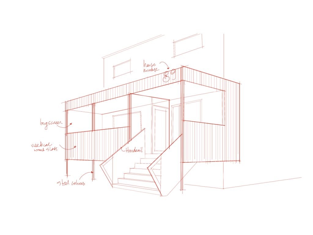
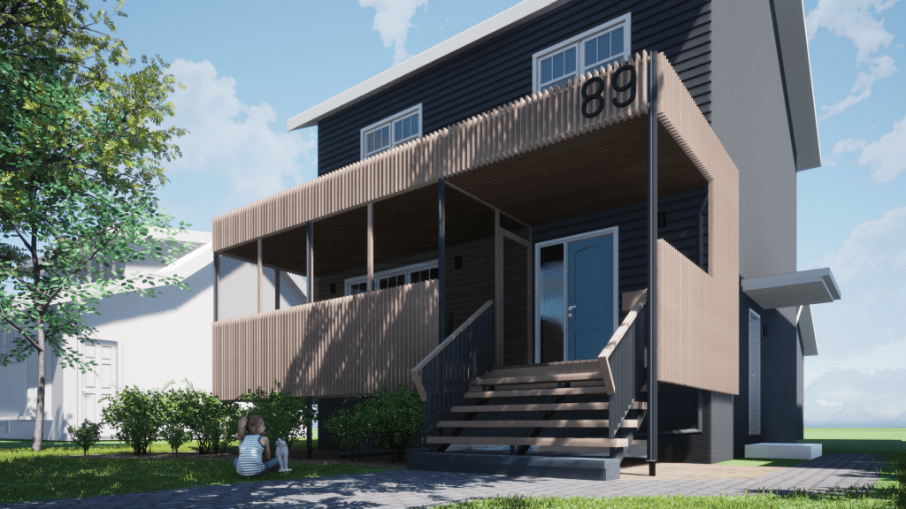
This early 3D model played a big role in shaping where the design eventually landed. I was experimenting with materials—trying to find a palette that felt both grounded and expressive. Given my long-standing love for the natural contrast between wood and metal, the direction came together pretty quickly. That combination has always spoken to me—raw yet refined, warm against cool. And in this case, it paired beautifully with our home’s existing grey stucco and white trim. It felt like a conversation, not a clash.
As the idea of a screened porch evolved, I started to see the screening itself not just as a practical feature, but as a central design move. It wasn’t just about keeping bugs out, it became a way to create layered space. The screens offered texture and softness, a sense of enclosure without feeling boxed in. Almost every element of the design began to echo that semi-transparent quality, filtering light, creating shadow, offering a sense of privacy while still staying visually open to the yard and the street beyond.
That balance, between shelter and openness, is something I keep coming back to in my work. It’s essential to wellbeing-first design. When done right, it helps blur the line between indoors and out, supporting a calmer, more connected way of living. And for this little porch project, that idea became the anchor.
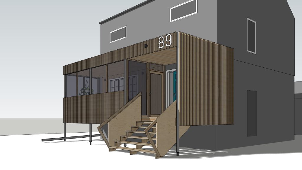
Here’s a rendering from 2021, showing the concept my family finally agreed on after a lot of debate (or, maybe they just caved to my architectural stubbornness!). It definitely continued to evolve through the permit and construction phases, but I’m happy to say we stayed true to its original spirit.
3. Design Decisions: Form Follows Purpose
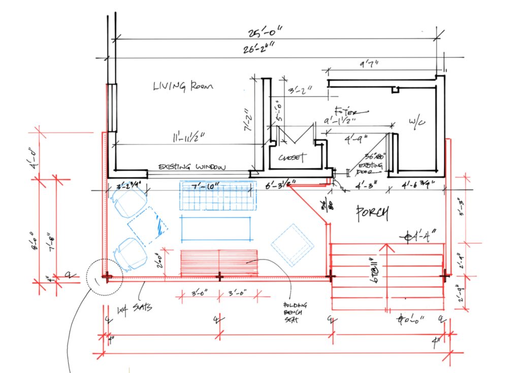
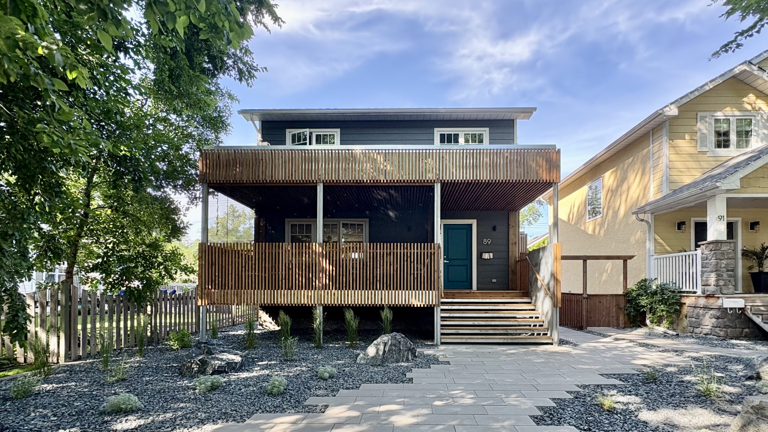
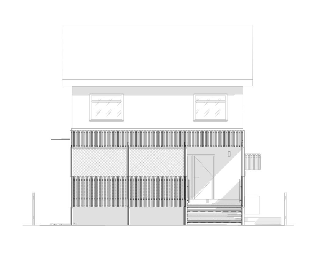
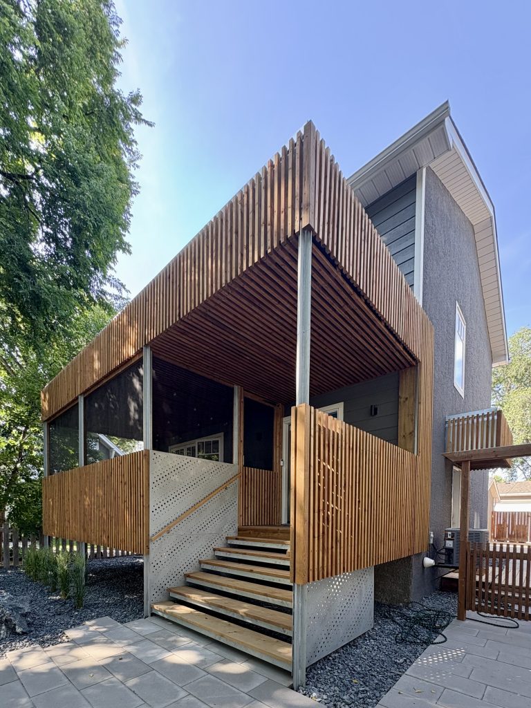
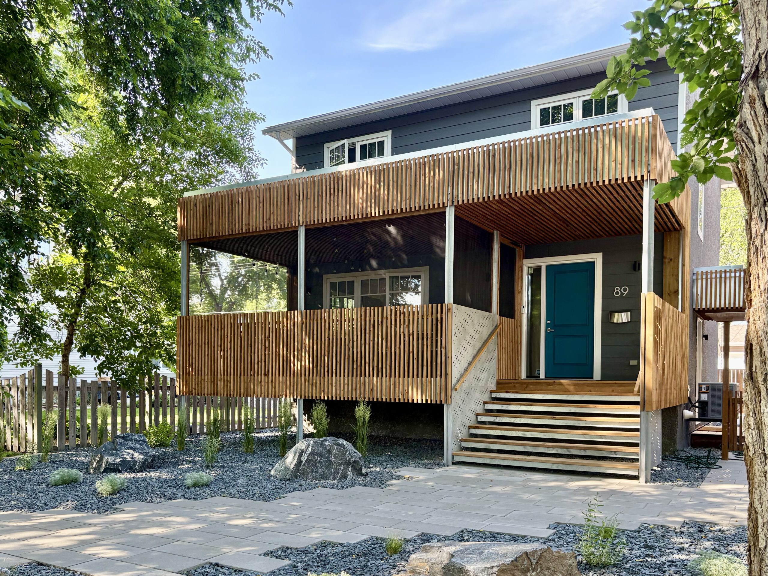
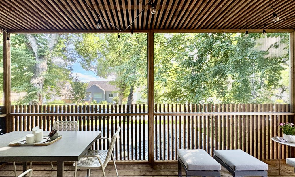
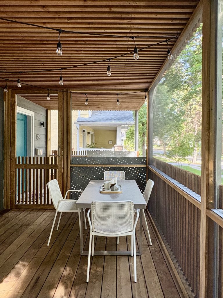
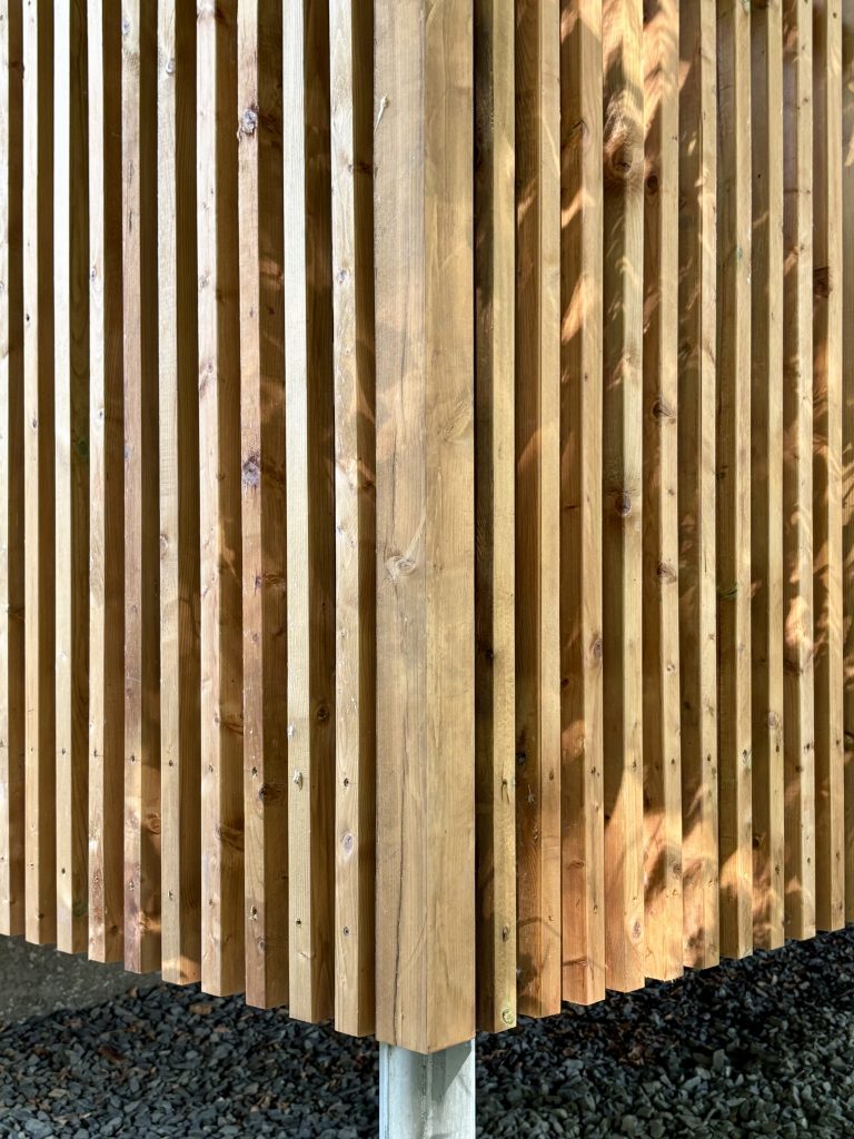
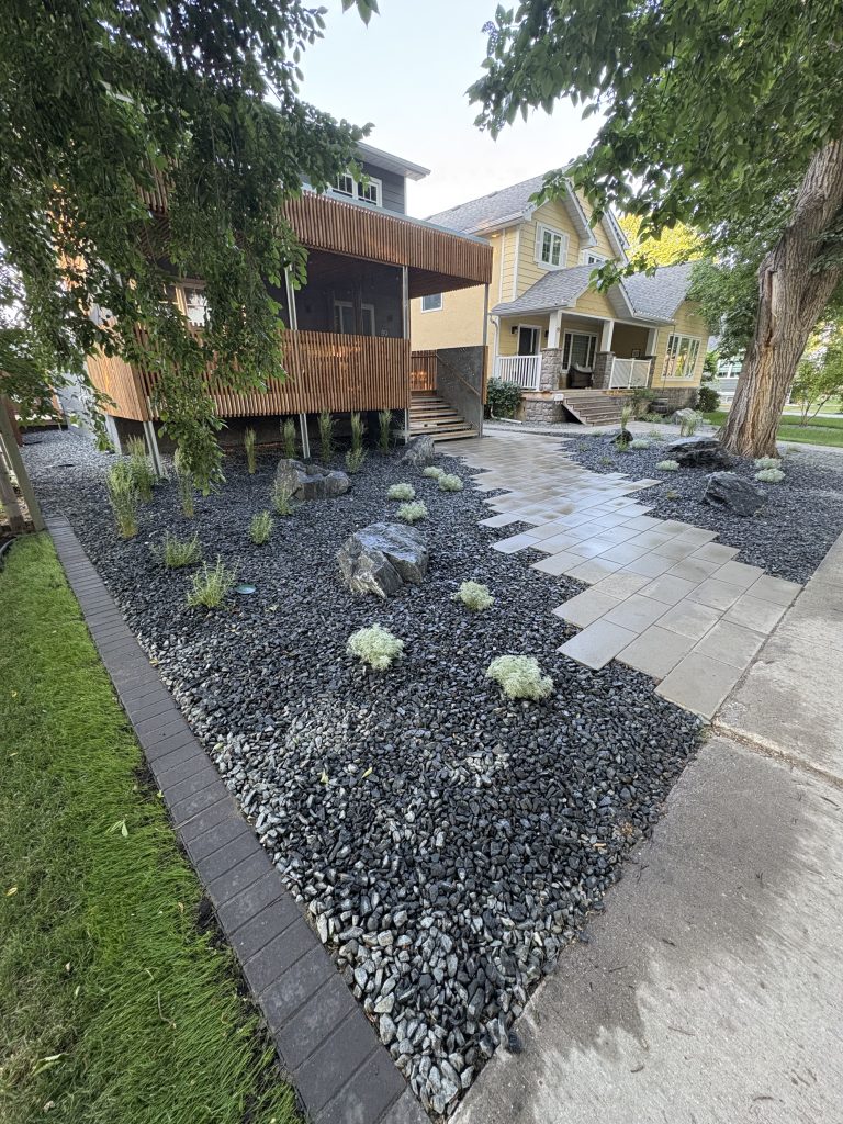
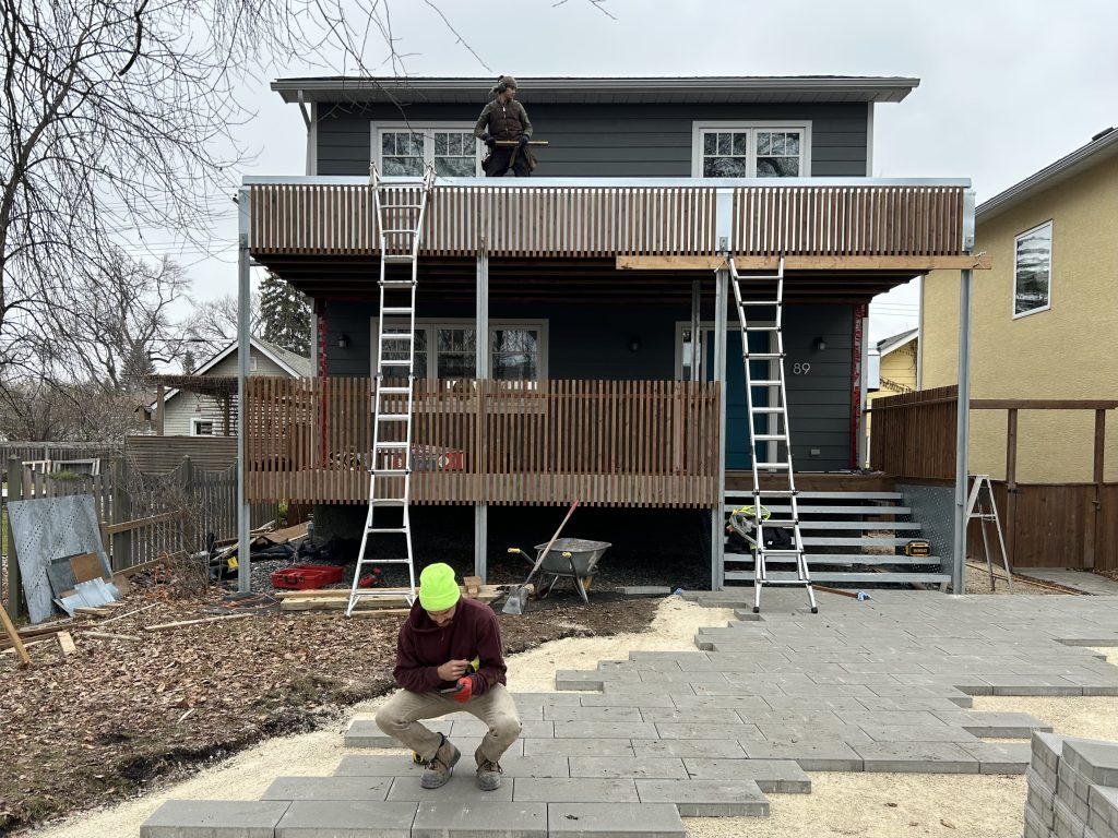
At its core, this porch became an exploration of structural rhythm and material honesty. The framework is straightforward but deliberate, four galvanized steel columns set 10 feet out from the house, spanning a total of 25 feet across the front. The easternmost 8 feet are carved out for a custom staircase, a blend of steel and wood that leads gracefully up to the front door. The remaining two bays form the main screened-in outdoor room, around 160 square feet of calm, shaded space. Nothing excessive, nothing hidden, just clean lines, simple materials, and a structure that wears its purpose with clarity.
4. Material Choices: Cost vs Performance
When it came time to decide on the exterior cladding, I weighed three main options—each with its own appeal.
First was Accoya, an incredibly durable wood that undergoes a process called acetylation, where Monterey Pine is treated with a vinegar-based solution under high heat. The result is a wood that’s dimensionally stable, highly water-resistant, and virtually rot-proof. It even comes with a 50-year warranty for outdoor use. As an architect, I love what this material represents: longevity through chemistry, not coatings. But the price? Especially during the early COVID supply chain chaos? Just not realistic for our budget.
Next up was Western Red Cedar from BC, a classic, beautiful, and naturally rot-resistant choice. It had that warm, West Coast feel and would have looked amazing. But again, the cost was still too steep for what we were trying to achieve.
Which led us to option three: pressure-treated brown lumber from local suppliers. It hit the sweet spot. Affordable, readily available, and easy to work with. Choosing it meant we could reallocate funds to things that actually improved our day-to-day experience, like landscaping, backyard upgrades, and proper porch furniture and lighting. And since it doesn’t require staining or painting, it also fit perfectly with our low-maintenance goals.
Sometimes, the most sustainable choice isn’t the most glamorous one, it’s the one that lets you do more with less, and live better without the upkeep.
5. Structure & Detailing: A Dance of Wood and Metal
Foundation
We went with screw piles for the foundation, and honestly, it was a no-brainer. Quick to install, gentle on the yard, and most importantly, solid. In Winnipeg’s legendary freeze-thaw conditions, long-term stability is non-negotiable. Screw piles also happen to be low-impact and reusable, which made them a great fit for our sustainability goals.
Framing
The porch structure itself was refreshingly simple and practical:
Floor: 2×10 pressure-treated joists topped with 2×6 pressure-treated decking.
Roof: 2×10 pressure-treated joists with pressure-treated plywood sheathing.
Everything was designed for durability and minimal maintenance, no over-complication, just a solid frame that will hold up over time.
Bug Screening
Instead of the typical screen panels or stapled mesh, we took a more comprehensive approach: screening under the floor decking and above the roof framing. It might seem unconventional or maybe too much for some people, but this detail creates a fully sealed envelope, no gaps, no surprises. No spiders creeping up from the floorboards, no wasps sneaking in from the rafters. It’s the kind of detail that directly supports wellbeing, because peace of mind and bug-free comfort shouldn’t be afterthoughts.
Guardrails & Privacy Screen
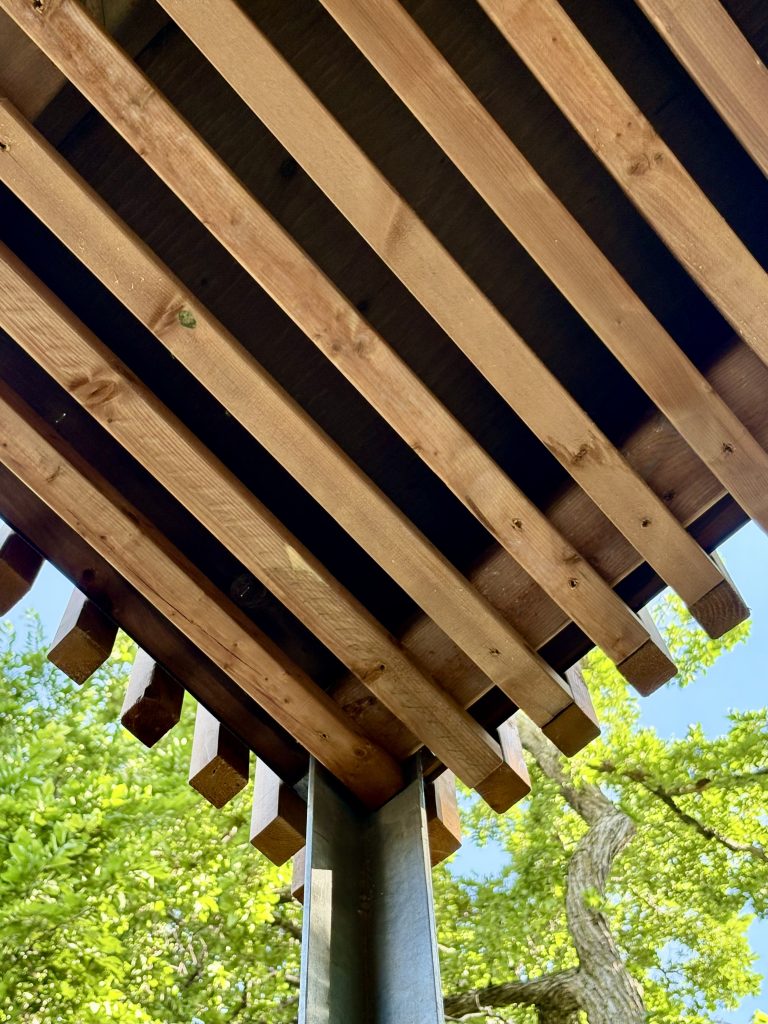
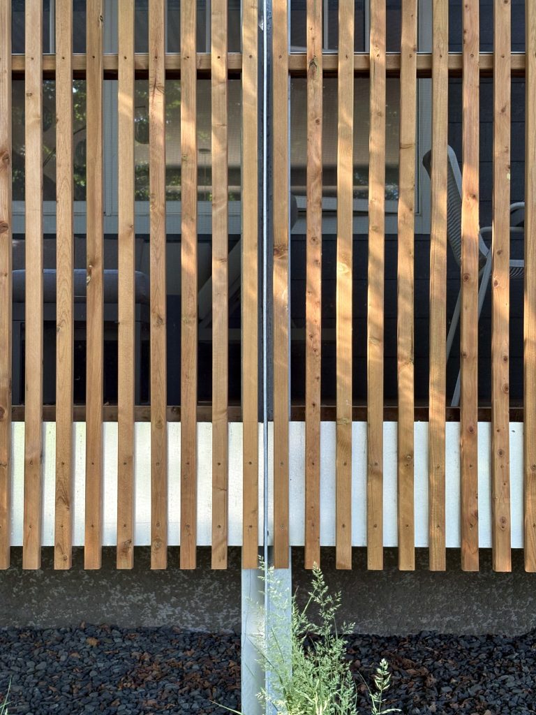
This was one of my favorite design moments. The guardrails double as a privacy screen, built from back-to-back 2×2 steel angles spanning between the main steel columns. On both sides of those steel frames, we attached 2×2 nailer boards, which allowed us to mount vertical 2×2 wood slats spaced 3 inches apart and also the frame of the bug screen on the inside face.
The spacing offers a subtle rhythm, enough privacy from the street to feel tucked in, but still visually open to the sky and trees. It serves both function and feeling: fall protection, filtered views, and a soft sense of enclosure without cutting us off from the world.
Ceiling
Even the ceiling got a bit of design love. First came the bug screen, applied above the roof joists. Then, we carried the same 2×2 wood slats from the facade up into the soffit, all spaced 3″ apart therefore covering about half the ceiling area. It hides the roof framing, adds warmth overhead, and continues that sense of layered texture. It’s one of those quiet details that makes the space feel finished, without needing drywall or fuss.

6. Structural Design – A brotherly hand
My brother, who happens to be a structural engineer at Wolfrom Engineering, was a huge part of making this project real. He brought the technical clarity and precision that helped turn a conceptual idea into something buildable and solid.
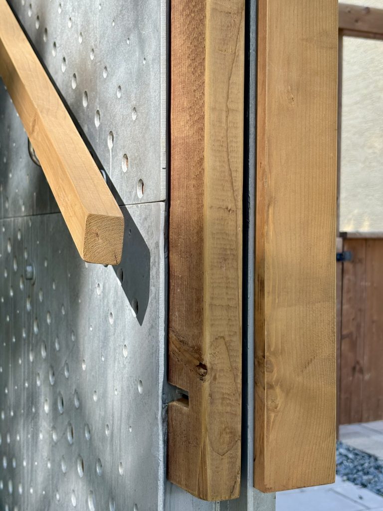
He fine-tuned the framing layout and helped us seamlessly integrate some of the custom details I was excited about, like the plus-shaped steel columns and the perforated steel stair stringers with 3×3 steel tread brackets. None of these were off-the-shelf parts, they were carefully drawn, coordinated, and custom fabricated to suit both the structural requirements and the architectural intent.
And beyond the aesthetics, choosing steel for these elements added a layer of long-term value. Its strength and durability mean less maintenance and greater longevity, key considerations when designing with sustainability in mind.
7. Small Details that Elevate Everyday Life
The ceiling height lands at a comfortable 8 feet, just right. Not too low to feel cramped, not so high that it loses its sense of intimacy. That balance of proportion and comfort is subtle, but essential. It’s one of those quiet decisions that supports how we feel in a space, grounded, at ease, and connected. Human scale matters, especially when designing for wellbeing.
The custom screen door follows that same thinking. It stands a full 8 feet tall to align with the architecture and is detailed to match the porch’s material language. The lower half is clad in the same vertical 2×2 slats used throughout the facade. It keeps things visually cohesive while offering practical protection for the screen, because let’s face it, screen doors and shoes don’t always get along.
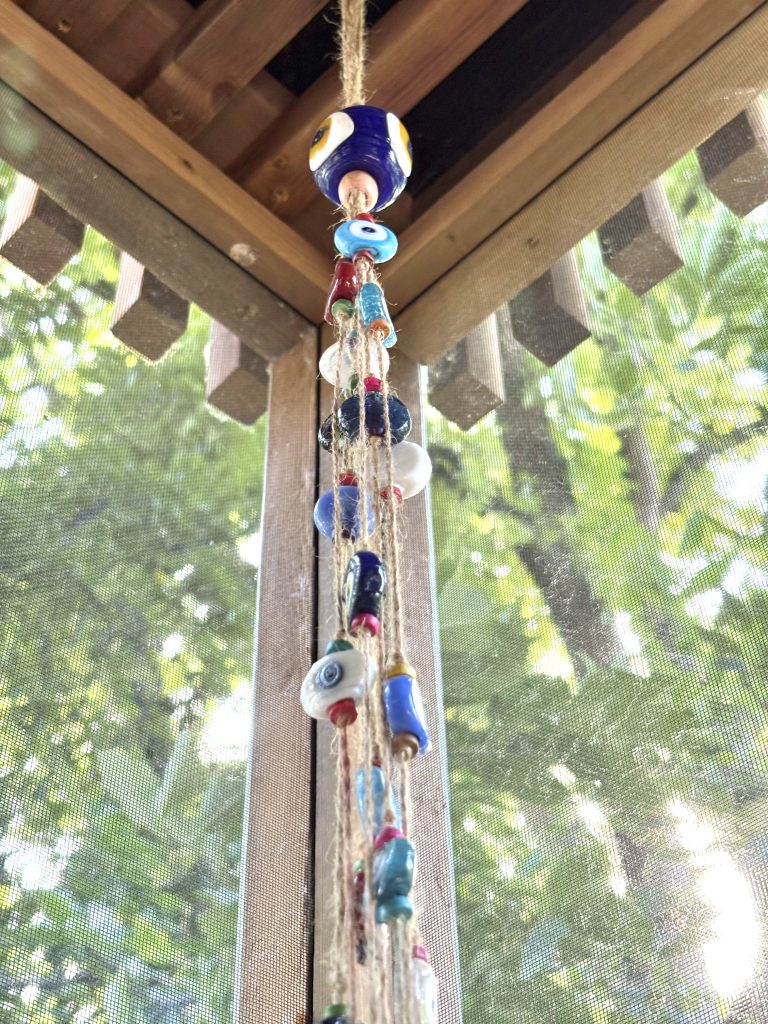
Lighting is soft and unfussy: warm, dimmable string lights stretched across the slatted ceiling. It gives the porch a cozy, inviting glow that’s perfect for lingering dinners, quiet evenings, or spontaneous late-night conversations. That kind of ambiance, gentle, human, and flexible, plays a quiet but important role in how a space makes you feel.
The furnishings are minimal and outdoor-friendly, chosen not just for durability but for the way they support the porch’s overall tone: relaxed, intentional, and welcoming.
8. Landscape: Quiet, Native, No Lawn
I didn’t want grass, I wanted peace. So we took the plunge and fully xeriscaped the front yard, turning it into a low-maintenance, low-stress little oasis. The goal was simple: less upkeep, more calm.
Here’s what brought it to life:
Crushed granite mulch for a clean, modern groundcover
Native prairie grasses like Karl Foerster and Prairie Dropseed for movement and texture
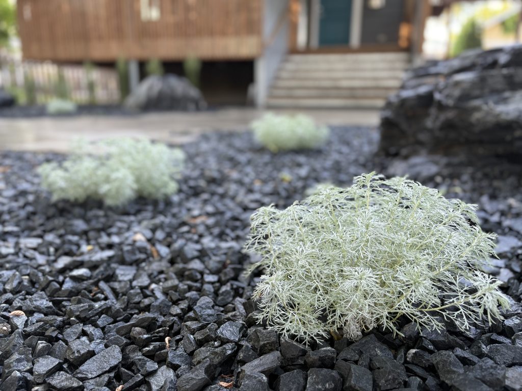
A soft mix of Russian sage and Silver mound for seasonal color and contrast
Staggered 12″x24″ Barkman concrete pavers to define a clear, inviting path
And a few handpicked boulders from Reimer Soils to ground the whole composition
The result is a landscape that feels calm, intentional, and grounded. There’s still a little bit of mowing, just the public boulevard section out by the sidewalk, but otherwise, it’s blissfully low-maintenance. No more battling patchy grass or dragging garden sprinklers around. This approach drastically reduces water use and upkeep, while supporting local plant life and resilience, an ideal solution for Winnipeg’s climate. Sustainable, beautiful, and built for real life.
9. A Note of Thank You
None of this would’ve come together the way it did without the right collaborators.
We partnered with Anvil Tree, an architect-led art installation and fabrication company with a real knack for custom wood and steel work. From the very beginning, they brought the kind of precision and attention to detail that any architect hopes to see but not always gets. Working with their team of talented makers, installers, and artists was not only seamless, it was genuinely fun. They understood the vision and treated every weld, joint, and alignment with care.
For the landscaping, we turned to B.Rocke Landscaping. I’d known the owner for a while, and their work had always stood out, especially their approach to xeriscaping and thoughtful plant selection for tough sites like ours. Our shaded, tree-heavy lot needed a more curated hand, and they delivered beautifully. The result is a front yard that truly feels in sync with the house and with nature itself.
To both teams, thank you. You helped turn this vision into a space that supports our lives every single day.
10. What It Means Now
This porch has truly reshaped the way we live at home. It’s where the day begins, with a quiet cup of tea, and where it often winds down in the evening breeze. It keeps us connected: to the rhythm of the seasons, to the street outside, and to the neighbours passing by. It keeps the bugs out, lets the light in, and asks very little of us in return.
It’s not showy. It’s not luxurious. But it’s thoughtful, functional, and quietly joyful. And to me, that’s what great design is all about.
This space is a small but powerful reminder that when architecture is aligned with how we truly live, when it supports comfort, simplicity, and sustainability, it can elevate everyday life in the most meaningful ways.